Verifying...
Lark Brand Refresh

Introduction
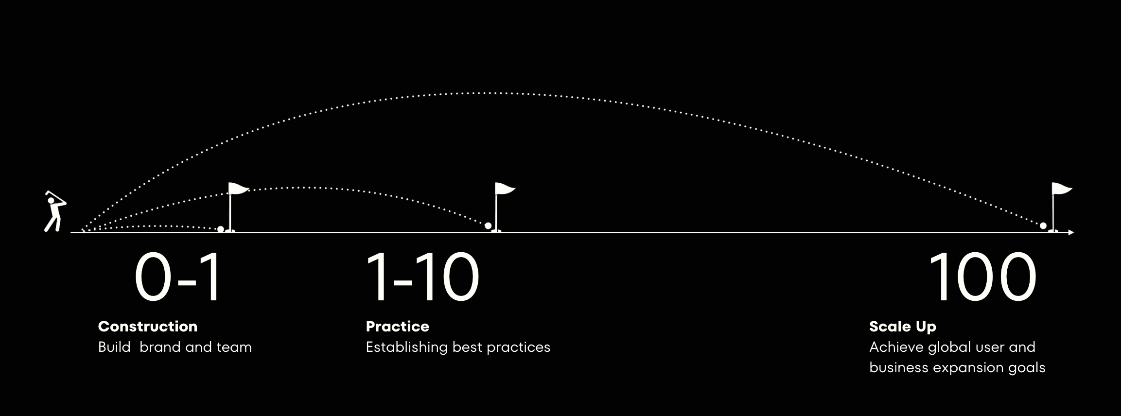
The first milestone in Lark's journey towards commercialization and internationalization, transitioning from an internal communication and collaboration tool within ByteDance, is the brand refresh. This marks the achievement of the first of three strategic design objectives I set for the team upon joining ByteDance.
Branding House
Exceptional design amplifies the essence of the brand's tone, with the brand architecture serving as the compass for design direction and framework. Upholding the brand tone of efficiency, enjoyment, leadership, and futurism, my team and I crafted a superlative brand symbol.

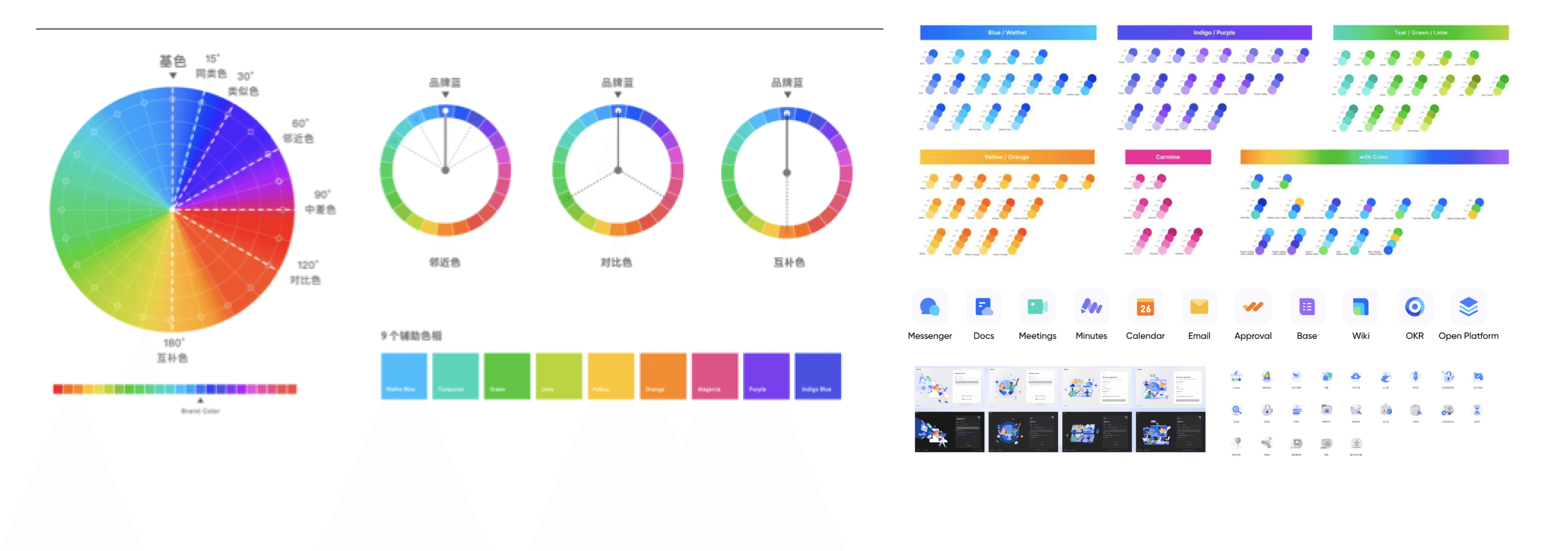
New Color System
Under a unified design language, both brand and product design adopted a new color system, with all secondary sub-brands and tertiary symbols of Lark receiving a fresh brand upgrade.
Result
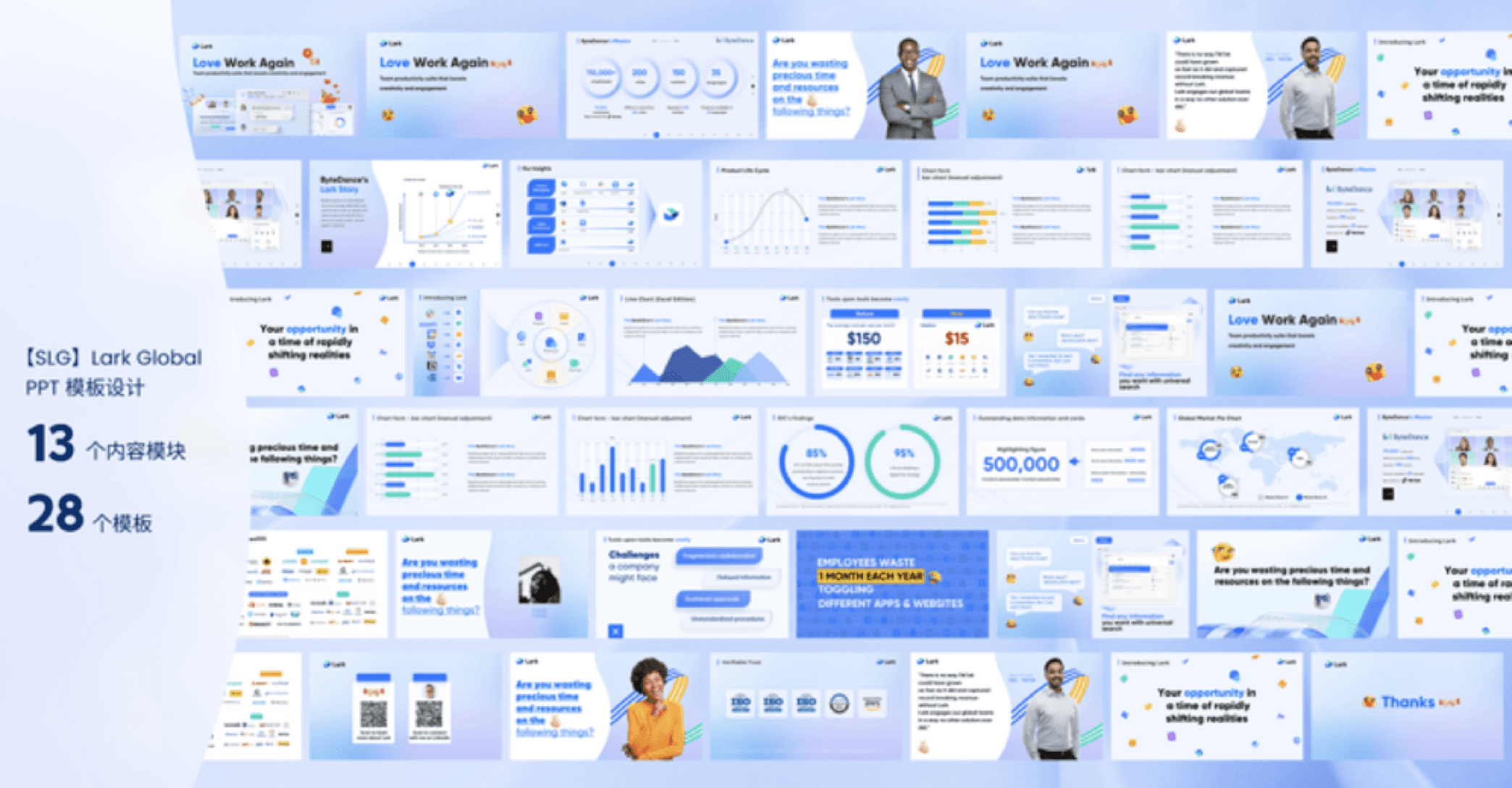
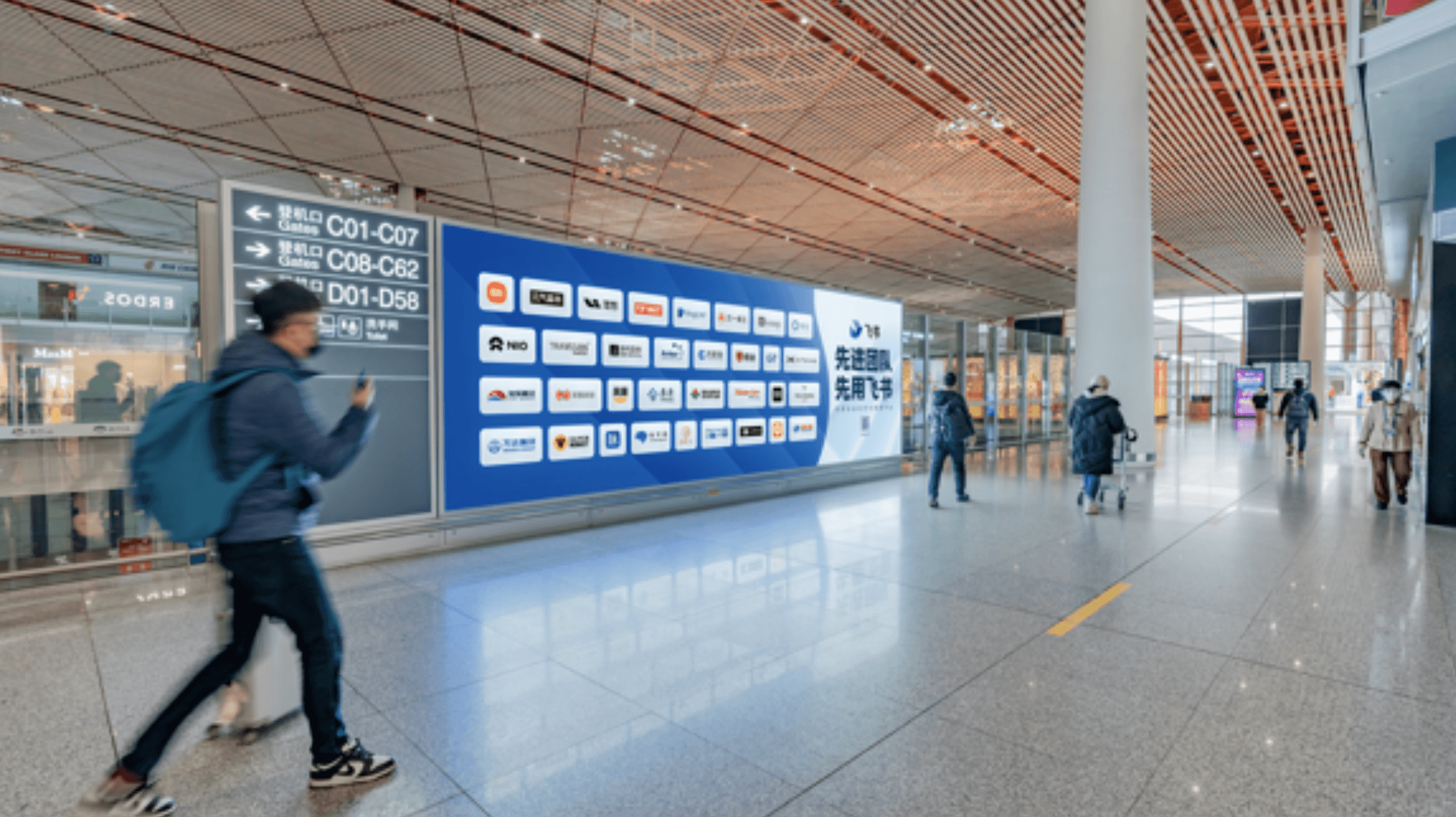
Simultaneously, I led the team in spearheading the design for offline launches, pre-sales materials, and airport advertisements. Through two years of effort, by 2022, the NPS and satisfaction metrics of the Lark brand have achieved the highest results in the company's history.

Here is more about Lark's Design.