Verifying...
The Scroll Trap: Why the Web Forgot How to Be Read
The Scroll Trap: Why the Web Forgot How to Be Read
Here's something I rarely see acknowledged: nearly every page on the internet is a single column of text. One column. Stretching downward. Forever.

You read a line, your eyes snap back to the left, you read the next line, snap back, read, snap, read, snap — and somewhere between paragraph four and paragraph twelve, you start scrolling faster. You skim. You bounce. The content might be extraordinary, but the container has already lost you.
This isn't a content problem. It's a typography problem. And it's been hiding in plain sight since the dawn of the web.
The Column Was a Compromise
Print solved this centuries ago. Open any newspaper, any magazine, any beautifully typeset book. Text lives in narrow columns — not because designers enjoy complexity, but because the human eye reads faster and retains more when line lengths stay between 45 and 75 characters.
Research from the Baymard Institute confirms it: optimal line width directly correlates with reading comprehension and completion rates. The Nielsen Norman Group has documented that users read only about 20–28% of text on a typical web page — and layout is a significant factor.
The web chose a different path. Single-column layouts were easier to build, easier to make responsive, easier to maintain. The compromise was invisible at first. But as content grew longer and richer — as AI-generated text, long-form analysis, and multimodal conversations became the norm — that single column became a trap. Not a container for reading, but a treadmill.
People don't finish reading on the web. Not because they lack attention, but because the layout never invites them to stay.
The Image Problem Is Worse Than You Think
In a well-designed magazine spread, an illustration isn't decoration — it's orientation. It anchors the eye, breaks the rhythm intentionally, creates a moment of visual rest before the next passage. Text and image exist in dialogue. The placement is the meaning.
On a single-column web page, that relationship collapses. An image is either above the text or below it. It interrupts rather than accompanies. The spatial conversation between word and picture — the this is what I'm describing, right here beside my words — is replaced by a vertical stack where everything competes for the same narrow lane.
This isn't a minor aesthetic complaint. It's a comprehension issue. When image and text are spatially disconnected, the reader has to reconstruct their relationship mentally. That cognitive overhead adds up, quietly, across every scroll.
Now Add AI to the Equation
There's an emerging problem that makes this even more urgent. AI conversations are increasingly multimodal — text interleaved with charts, diagrams, code blocks, generated images. The output is rich, but the presentation is almost universally a single-column chat stream.
How do you help a reader understand the relationship between a paragraph of analysis and the data visualization it references, when both are stacked vertically with the chart either above or below, never beside? How do you make a complex AI-generated report scannable, when every element — text, table, image, callout — occupies the same column width and competes for the same visual weight?
The multi-column, media-integrated layout isn't nostalgia for print. It's the answer to a question the AI era is only beginning to ask: how do we present dense, multimodal content in a way that respects human reading patterns?
The Design Tool Gap
Here's where it gets personal. I set out to build this — multi-column text with media that wraps around actual content shapes, not rectangles — and discovered that even the design tools don't support it well.
Try creating a contour text wrap in Figma. You'll find workarounds, manual path tracing, and a lot of patience. It's possible, but it's labor. Every change to the illustration means re-editing the wrap path by hand. Try it in any web-based design tool. The story is similar.
If the tools designers use to imagine layouts can't fluently express contour wrapping, it's no surprise the web never adopted it. The gap isn't just in browsers — it's in the entire pipeline from concept to implementation.
I wanted to close that gap. Not with a design mockup, but with a living, functioning component that a designer could drop into a Framer project and have text respond to shapes automatically. No path editing. No manual adjustments. Drop it in, toggle "Contour," and the text sees the shape.
What "Seeing Shapes" Means for Reading
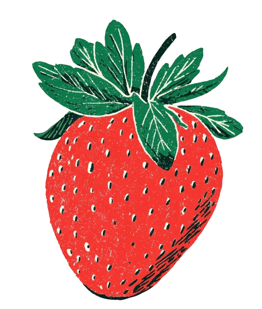
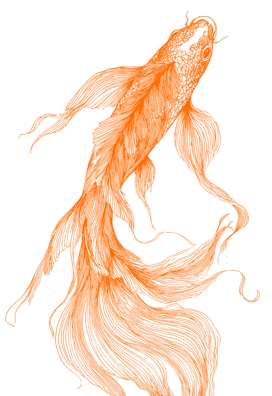
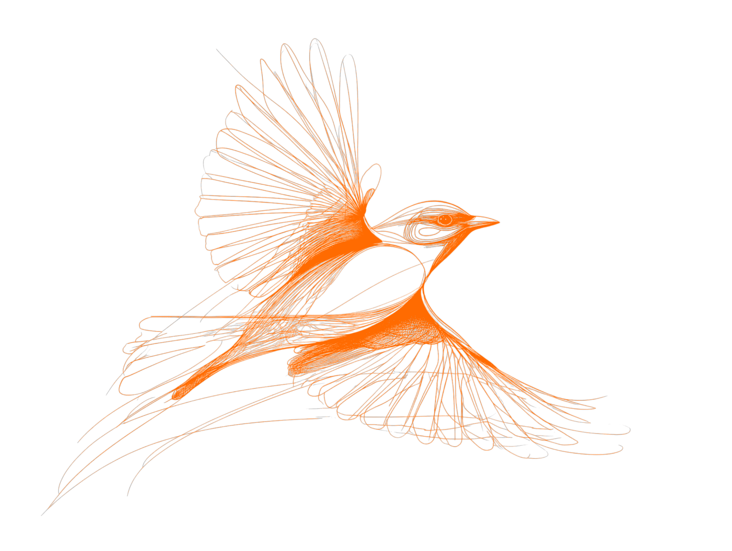
When text wraps along the contour of an illustration — following the curve of a lighthouse, hugging the edge of a data chart, flowing around an animated icon — something subtle happens. The image stops being an interruption and becomes part of the typographic rhythm. The reader's eye doesn't have to leave the text to find the image. They coexist.
This is the principle that print typography has relied on for generations. And it matters more than aesthetics.
A 2022 study published in the Journal of Usability Studies found that layouts integrating text and visual elements in spatial proximity increased task completion rates by up to 34% compared to vertically stacked equivalents. Readers didn't just prefer the integrated layouts — they understood the content better and spent more time with it.
Elegant typography doesn't just look better. It performs better. It encourages readers to finish. It reduces bounce. It turns a page from something to scroll past into something to inhabit.
The Invitation to Stay
I've come to believe that the single-column web isn't a technical constraint anymore — it's a habit. The tools exist to break it. The research supports breaking it. The rise of AI-generated multimodal content demands breaking it.
What's been missing is a bridge: something that lets a designer think in terms of editorial layouts — columns, contour wraps, integrated media — without needing to hand-code the underlying complexity. A system where the designer's intent ("this illustration sits here, text flows around its shape") translates directly into a living, responsive layout.
That's what I built. And the measure of its success isn't whether it's technically impressive. It's whether a reader, encountering a page that uses it, stays a little longer. Reads a little further. Understands a little more.
Because the real UX problem was never "how do I wrap text around a shape."
It was always: how do I make someone want to keep reading?
Reference: https://github.com/chenglou/pretext