Verifying...
AI Design System - Part 2 Typography for Taste
This project began as an experiment in AI-assisted font pairing and automated type system generation. But the deeper design challenge was more human: how do we let automation accelerate design systems work without hiding the judgment designers still need to make?

Typography is one of the easiest parts of a design system to mistake for mathematics.
From a distance, it seems orderly: choose a typeface, define a scale, assign weights, create named styles, and distribute them across screen sizes. If every style has a name and every value has a number, the system appears complete.
But typography is not only a table of values. It is rhythm, voice, density, hierarchy, and restraint. A large heading can feel quiet in one typeface and theatrical in another. A body style can feel readable, cramped, warm, or clinical depending on x-height, width, letter spacing, and context.
That was the central tension behind this project. I was designing an AI-powered typography generator, but I did not want it to behave like an oracle.
The tool’s promise was simple: a designer describes a desired visual direction, receives several font-pairing options, chooses one pairing for product interface typography and another for editorial reading, then generates a complete responsive type system.
On paper, this sounds like automation. In practice, it became a product design problem:
How can AI accelerate typographic decisions without hiding the judgment designers still need to make?
The Hidden Risk of Clean Numbers
One of the most revealing moments came from a small hierarchy issue.
The system generated four body-level styles: Body, Callout, Detail, and Tiny. Conceptually, these levels were meant to support different interface needs. Body would carry standard content. Callout would sit slightly quieter. Detail would support secondary information. Tiny would handle labels, captions, or dense metadata.
Structurally, everything looked correct. The output had four named styles. Each had a size, line height, and spacing value. But when I inspected the actual generated sizes, something had gone wrong.
Body and Callout had collapsed into the same size. Detail and Tiny had collapsed into another same size.
There were four labels, but visually only two steps.
The culprit was a well-intentioned rule. To keep values tidy, the system rounded smaller type sizes to even numbers. It sounded reasonable. Design systems often prefer clean values. But here, neatness erased nuance. The algorithm preserved structure while destroying perceptual hierarchy.
That moment became an important reminder: a design system can look organized and still fail visually.
The fix was not simply technical. It required reframing the priority. The purpose of the type scale was not to produce the cleanest possible numbers. The purpose was to preserve meaningful visual difference. Odd sizes like 11px or 13px were acceptable if they helped the hierarchy breathe with more precision.
Cleanliness is useful only when it protects clarity. When it removes distinction, it becomes decoration.
The Specimen Page as a Trust Surface
That discovery reinforced a core product decision: after generating the typography system, the tool should also create a dedicated specimen page.
This page was not a decorative extra. It was a trust surface.
Designers should not be asked to accept AI output because it appears in a list of generated styles. They need to see the system rendered as real text. They need to compare levels, scan rhythm, feel density, and decide whether the hierarchy works in context.
Typography has to be judged with the eye, not only validated by data.
The specimen page transformed the AI’s output from a hidden operation into a visible proposal. It allowed the tool to say: “Here is a strong starting point. Now look.”
That distinction shaped the entire experience. The system was not designed to deliver a final answer. It was designed to generate a useful first draft, make that draft inspectable, and leave room for the designer’s taste.
For AI design tools, this is essential. The more powerful generation becomes, the more important inspection becomes. Designers do not only need output. They need evidence.
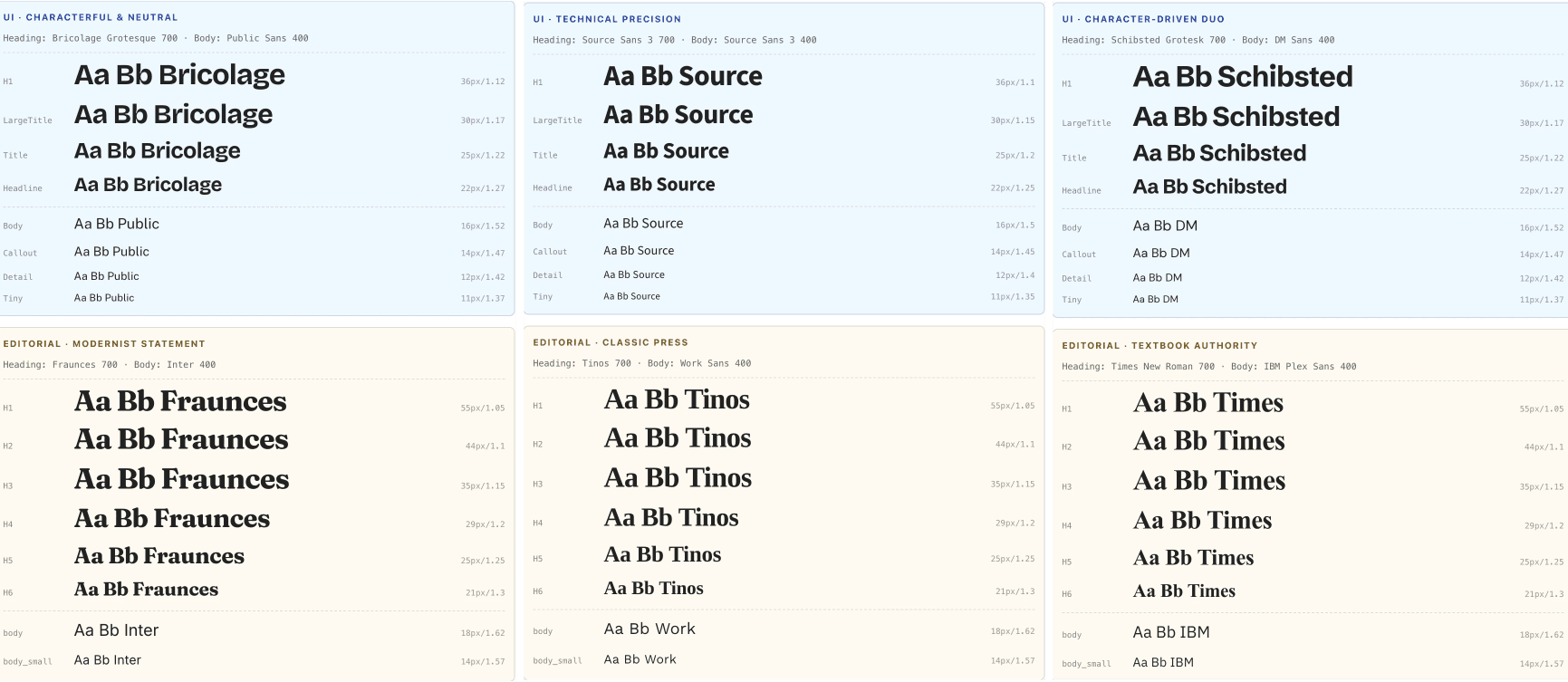
Separating Interface and Editorial Typography
Another important decision was to separate interface typography from editorial typography.
Interface typography supports navigation, labels, controls, dense information, and repeated scanning. It needs clarity, utility, and consistency. Editorial typography has a different responsibility. It carries long-form reading, pacing, atmosphere, and voice. It can afford more expressiveness because its job is not only to organize information, but to sustain attention.
So the generator treated them as related but distinct systems.
For interface use, the levels were product-oriented: H1, Large Title, Title, Headline, Body, Callout, Detail, and Tiny. For editorial use, the levels followed reading semantics: H1 through H6, body, and small body text.
This made the system slightly less “pure” in an abstract design-token sense. There were now two typographic hierarchies instead of one universal ladder. But it made the tool more useful. A design system should not be elegant only in documentation. It should reflect the real contexts designers work within.
[Image placeholder: Comparison between interface typography hierarchy and editorial typography hierarchy]
Designing for Failure Without Breaking Flow
The project also clarified the importance of graceful failure.
AI may recommend a font weight that a family does not actually support. Fonts may load differently across environments. Layout behavior can be less predictable than design documentation suggests. A brittle tool would expose each edge case directly to the designer and interrupt the workflow.
Instead, the system needed to absorb predictable failures wherever possible.
If a requested font weight was unavailable, the tool could fall back to a safer default and continue. If a dynamic layout behavior was unreliable, the generated specimen could use a simpler fixed structure. If the type scale looked valid but weakened hierarchy, the scale logic needed to prioritize visual distinction over numeric tidiness.
These were small decisions, but they reflected a larger UX principle: a design tool should protect the designer’s momentum.
Designers should remain aware of important choices, but they should not be forced to debug every implementation edge case. The tool should feel safe, reversible, and legible.
That is why the flow began with a backup step. Applying a generated type system could replace existing styles, so the first interaction needed to create confidence. Before asking designers to experiment, the tool had to make the experiment recoverable.
Trust is not created by promising that nothing will go wrong. Trust is created by showing users that they can recover when something does.
AI as Proposer, Designer as Pruner
Working with AI also revealed a recurring pattern: AI is often a generous proposer, but a poor pruner.
It can suggest more layers, more abstractions, more rules, more fallback systems. Sometimes that is useful. But often, the better design decision is subtraction. Use an existing style instead of creating a new one. Accept a simple layout constraint instead of over-engineering around it. Add one resilient fallback instead of rewriting an entire recommendation system.
In this kind of work, the designer’s role becomes editorial. Not just designing the interface, but editing the behavior of the machine.
This may be one of the most important skills in AI-assisted design systems work: knowing when to stop. Knowing when a system is robust enough. Knowing when an elegant abstraction is actually hiding unnecessary complexity. Knowing when the simplest solution is not a compromise, but the clearest product decision.
AI can expand the possibility space very quickly. The designer’s responsibility is to compress it back into something usable, intentional, and humane.
The Real Goal
In the end, this project was never about replacing typographic taste.
AI can propose font pairings. It can generate scales. It can calculate responsive values. It can prepare the first version of a system much faster than a designer could build it manually from scratch.
But it cannot fully know whether a heading feels too formal, whether body text has the right warmth, whether a hierarchy breathes, or whether a brand voice has emerged.
That is still the designer’s work.
The best version of this tool does not remove that work. It creates a better surface for it. It makes the system visible. It makes decisions reversible. It turns hidden automation into something designers can inspect, question, and refine.
A good AI design tool should not ask designers to surrender control.
It should give them a clearer place to exercise it.