Verifying...
AI Design System - Part 1 Color
AI Design System - Part 1 Color
Why design and code never really aligned — and what changes now

If you've shipped products for any length of time, you know the scene. The designer hands off a mockup they've polished for days. The engineer builds it. And somewhere in production, a color is just off, a spacing is just wrong, a corner is rounded the wrong way. You go a few rounds. Both sides privately conclude the other isn't being careful enough. It usually ends with "let's ship it and fix it next sprint."
This isn't anyone's fault. Design systems and frontend architecture speak two different languages. Designers speak in intent — this should feel emphasized, this should recede, these elements are part of the same narrative. Engineers speak in structure — this is state, this is a prop, these components share a context. The handoff between those two languages is where almost all the loss happens. The industry has spent over a decade trying to close the gap. Material Design. shadcn. Tokens Studio. Style Dictionary. Component libraries of every shape. None of it fully worked. Not because the tools were bad, but because the role in the middle — bilingual, proactive, organizing — was never really filled.
The arrival of AI Agents finally fills that seat.
The point here isn't the tired productivity story of "AI writes your code." The real shift is this: when an agent can actively read both sides, find the mismatches, and propose alignment, architectural decisions that were compromises — forced by the cost of coordination — can be reopened. This is a renegotiation of which trade-offs are still necessary.
Nowhere is this renegotiation more visible than in how we organize tokens.
The compromise: tokens as a flat table
For years we've flattened tokens into a single table. primary-color: #E26E41 — simultaneously a semantic ("the main brand color") and a physical value ("this specific orange"). The two got collapsed because keeping them separate was too expensive. If the designer changed the hue, the engineer had to chase it down by hand, one typo away from a broken build. So we stopped trying. We wrote it as one line, and quietly accepted that cross-project reuse was basically impossible.
That collapse hides a second collapse you stop noticing: the color space itself. Almost every existing system stores colors as hex or hsl. Both are computationally convenient but perceptually wrong. In HSL, lightness: 50% on yellow looks roughly as bright as 90%; on blue it looks like 30%. "Make this 10% darker" means something different at every hue. You can't algorithmically derive a hover state that holds together across a brand palette, so you don't try. You hand-tune every variant. The flat table is the only thing that scales.
The unlock: layered tokens, perceptual color, decisions in code
With an agent in place, that compromise comes undone. Tokens want to be layered:
The semantic layer is what the designer owns —
primary,secondary,warning— a contract about where each role is usedThe physical layer varies per project — the specific orange, the specific red, whatever the brand needs in context
The mapping layer binds them together — a config file, a JSON blob, a runtime lookup, whatever fits
But layering alone isn't enough. The color values themselves need to live in a space the algorithm can reason in. The system I've been building stores every token in OKLCH — L for perceptual lightness, C for chroma, H for hue. The reason is concrete: when L is constant, two colors at any hue look equally bright to the eye. That single property does three things at once:
Hover and active states derive themselves. Subtract a constant from L; keep C and H. The generated variant is automatically in tune with the source.
Dark mode is a mirror, not a redesign. Reflect L across 0.5 (0.95 ↔ 0.15), leave hue alone. The brand color doesn't drift in dark. Surface tokens flip cleanly. Text contrast is preserved structurally, not by hand.
Contrast is a subtraction, not a weighted formula. WCAG's contrast math is sRGB-weighted; it works for dark-on-light but breaks down in dark mode. With OKLCH, ΔL ≥ 0.5 is readable body text, ≥ 0.4 is acceptable for headlines, ≥ 0.3 is decoration only. The algorithm rejects any text/surface pairing that falls below threshold before it ever reaches the agent.
This is the part most "AI design system" conversations skip. The agent isn't smart enough to fix a bad color space. But on top of a right color space, the agent suddenly has leverage.
Separate the three layers, write them in a space that supports reasoning, and the same design system ports across projects. Semantics stay put. Physical values swap out. The mapping regenerates. What the agent actually does here is concrete and narrow: it reads the sources (Figma variables, the project's CSS custom properties), finds what doesn't line up, names the orphans, catches the drift, and produces a reviewable list. It doesn't decide for you. It assembles everything a decision needs.
The loop: agent organizes → human decides → the system leaves a trace
The thing that makes this actually work is the loop, not the agent's intelligence.
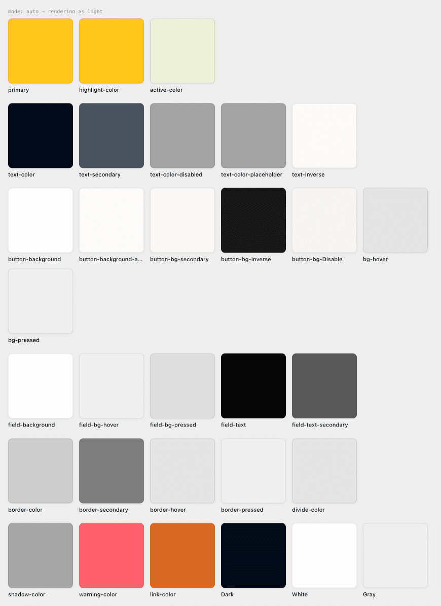
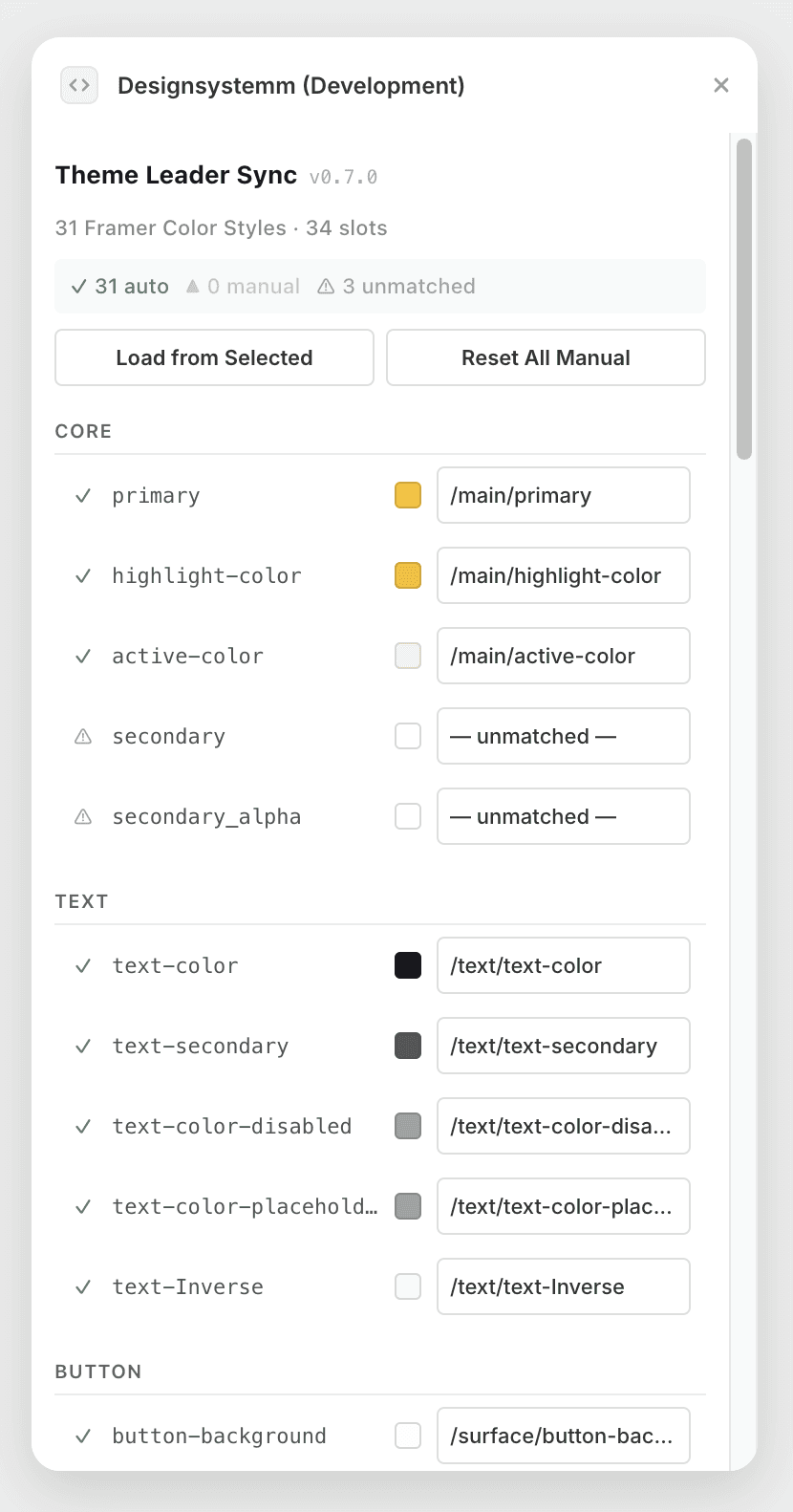
This isn't an abstract framework. It has a shape. One example from what I've been building — a plugin that keeps a theme system in sync with a project's color library. The agent's job isn't to make design choices. It's narrower than that: scan every color asset in the current project, match it against the 32 semantic slots the design system defines, and lay the results out.
Why 32? Not a round number, not a budget. It's the minimum complete set: ~10 brand/core slots (primary, link, status colors), ~6 text slots (primary/secondary/tertiary/inverse/link/disabled), ~10 surface and border slots (canvas, card, elevated, border-default, border-strong), and ~6 neutral slots. Add more and you create false choices for the agent. Add button-bg and the agent picks it instead of primary, and now changing primary doesn't change buttons. The slot count is a constraint on the agent, not on the designer.
Auto-matched slots show a green check. Manually locked slots (where the designer has overridden the agent) carry a purple mark. Unmatched slots get a warning icon. Orphaned bindings (where the resource a slot pointed to has been deleted) get flagged. A designer opens this panel and in seconds knows exactly where to look. They don't start from zero. They respond to the agent's proposal — accept it, or override it. The override is captured as "manual lock," so the next time the agent runs, it won't undo the decision.
The boundary between live and static
This is the part that matters. In the old world, alignment work happened in chat threads, in verbal handoffs, in comments buried three layers deep in a Figma file. Now the whole causal chain lives in the tool's interface: who changed what, when, why, and what the system will do about it next. The design system itself becomes a maintained, auditable asset — not a set of conventions surviving only in a Figma file and the margins of a codebase.
The component graph as a shared fact
The same pattern reopens an older problem: which components depend on which tokens. In the old setup, this knowledge lived in the engineer's head, and the answer was "let me grep the codebase and get back to you." Now an agent can keep the component-to-token graph as a shared fact. A designer can ask "what breaks if I change primary?" An engineer can ask "what is this component assuming about text-secondary?" Both sides query the same source of truth.
There's a subtler version of this: paired tokens. primary and on-primary are a contract — the background and the text that lives on it — and using one without the other is a bug. Most design systems treat this as engineer folklore. The system I built makes it explicit: every slot carries a pairWith field, so when the agent picks primary for a button background, it knows it must use on-primary for the label. The pairing isn't documented in a wiki. It's a field in the data the agent reads.
The boundary between live and static
The third compromise worth reopening is the boundary between live and static.
Design systems have historically shipped on cadence. A token package every quarter. Engineers upgrade, projects catch up, everyone moves together. That rhythm wasn't chosen — it was forced, by the sheer cost of propagating changes. If you could change a color and have every product update instantly, who would wait three months?
Agents make instant propagation possible. But in the process they expose a more subtle decision: not every token should be live.
Some should — semantic colors tracking the source of truth, spacing systems updating once and applying everywhere. Others should stay pinned — base colors used to derive entire scales, where a live change creates an off hover state halfway through a pageview; font configurations optimized at build time, where runtime lookups sacrifice performance for flexibility nobody asked for.
Which layers move, which layers hold, is an architectural decision. It's not a tooling question. It's a question of understanding your own system. The agent can execute your decision, can surface every consequence, but it can't decide for you. You need to know what you're building.
Subtraction first
There's one principle I've come back to more than any other while building this: make the agent's world smaller, not larger.
The first version of my plugin exported 44 token entries. The agent choked on the surface area — branded variants mixed with semantic slots, raw palette colors visible alongside tokens that were supposed to be the abstraction over them. The fix wasn't a smarter agent or a better prompt. The fix was a single boolean field, enabled, that the designer flips to gate what the agent can see. 44 entries collapsed to 32 visible to the agent, which in practice collapses to the ~15 a page actually uses.
Every layer does this work: the algorithm sees OKLCH, the agent sees semantic slots, the component sees var(--primary). Each layer hides what the next layer doesn't need. The agent's quality is bounded by how cleanly each layer drew its line.
This is the harder discipline. It's tempting to give the agent more context, more fields, more flexibility — to let it "decide." But every field you expose is a decision the agent will get wrong eventually. The discipline is to expose the minimum vocabulary the agent needs to do its job, and own the rest yourself.
The honesty problem
So back to the scene we started with. The misalignment between design and code was never about tools. It was about the absence of a bilingual, organizing, record-keeping third party in the middle. An AI Agent isn't a magic wand. It's just the party that was always missing.
But its arrival doesn't solve the problem automatically. It pushes the problem forward one layer. The question is no longer "how do we sync?" — it's "have both our languages actually been spoken clearly?" When designers name things inconsistently, the agent's output is inconsistent. When engineers don't publish their contracts, the agent can't see the boundaries. When the team makes decisions in Slack instead of in the tool, no trace survives. Every layer of honesty is what lets the agent's value compound.
This is a higher bar for clarity, not a liberation.
But a door has opened. The reason we accepted "design and engineering will always have a seam" was because closing it was too expensive. That cost has changed. What's worth doing now is taking another look at the system you already have. How many of the compromises you've accepted as given — as just how things are — are really just the residue of coordination cost?
The answer, if you look honestly, is probably more than you think.